
With so many issues competing for the public eye, raising public awareness is a constant challenge. Hard data is often the most compelling means of making your case, but it needs to be presented in a user-friendly manner if an audience is to really sit up and pay attention. Maps provide a highly effective and instantaneous means of telling a story – global or local – and achieving that visual WOW factor.
Over 10 years, Maplecroft has developed a portfolio of global data sets and interactive maps covering 170 plus issues, including terrorism, child labour, climate change vulnerability, human rights and natural hazards. These maps are used by companies, NGOs, international organisations and governments to pinpoint risks to operations, investments and vulnerable populations, as well as by the media, who use them as a tool to connect with audiences.
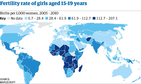
A prime example of Maplecroft's work in this area is our partnership on the Girls Discovered project with the Coalition for Adolescent Girls. Girls Discovered is a comprehensive online mapping and data resource, which has been developed to raise awareness of the myriad of issues affecting adolescent girls worldwide. By identifying, quantifying and visualising the key challenges facing girls the website aims to help private and public sector organisations to target their funding and campaigns to protect and invest in the future of the world's most vulnerable girls.
The maps cover over 200 issues such as: child marriage, age-specific fertility, literacy, HIV prevalence and female genital mutilation. Through powerful and effective mapping, these issues and the data quantifying them are brought to life, allowing Girls Discovered to raise awareness both of the considerable risks faced by girls living in today's societies, but so too of the crucial gaps in data and research on adolescent girls.
This experience has taught us that, used well, maps can provide a compelling and effective visualisation to raise awareness. Used badly however, and they can present a confusing, misrepresentative interpretation of an issue. With this in mind, what are the best ways of using maps to raise awareness?
Data sourcing is key
The backbone of any map is the data that is used to build it. Select data carefully, and make sure you understand its source, collection methodology and limitations. This will ensure your map portrays the message you want, and that the visualisation created does not misrepresent the facts on the ground.
Identify and understand your audience
For a map to be effective at raising awareness, it has to be both visually appealing and coherent to the target audience. Complex and detailed sub-national maps for example, illustrating a number of different indicators on one visualisation, may be useful in raising awareness in a development professional's environment. However, this level of detail may well fail to spark the imagination of the general public. To communicate with non-specialists, it may be more appropriate to focus on simpler images with catchy graphics and thematic colouring.
Think about the graphics, style and design
As with any visualisation tool, colour schemes, graphics and presentation styles are vital to ensure that maps have the greatest impact on their viewers. Tailoring your map fit to your organisation's theme, as well as the style of the report, webpage or presentation you are using it in, will add value and increase viewer receptiveness to the message.
Overlapping two indicators, using icons or varying sized dots on top of the background mapping colours, can add a significant dimension to the message portrayed. Be careful not to make the map too complicated though, or key messages may be lost.
Highlight key messages
It's often helpful to highlight some of the key messages you are trying to raise awareness of through the map you are using. This can be done by labelling specific countries of interest, particularly high or low risk environments, or countries in which data is not available but where this is vitally needed to improve understanding of an issue. This can also be done through the addition of text, photographs or graphics to attract the viewer's attention to key information.
Zoom in on focal areas and regions
Don't feel constrained by the need to show whole continents or countries. For many issues, sub-national or regional variations may be far more compelling, allowing a more detailed and nuanced picture to be displayed. Zooming in can provide a more specific focus, and enhance targeted awareness-raising within countries.
Make sure a map is the best way to present your data
Maps are, of course, just one of many different tools for data visualisation. For some indicators, for example measuring changes over time, maps are not the most effective tool and it's important to recognise their limitations. Using maps only when they are able to present a clear, compelling and informative visualisation will ensure they remain valuable and high-impact instruments for raising awareness of issues on both the global and national scale.
By Guy Bailey, head of atlases at global risk analytics company, Maplecroft, @maplecroftrisk
This content is brought to you by Guardian Professional. To get more articles like this direct to your inbox, sign up free to become a member of the Global Development Professionals Network
