
Public transit maps are a testament to the power of visual communication. They reduce the task of navigating hundreds or even thousands of miles of transport routes to simply glancing at an image. However, understanding a city’s transit frequency – how often the trains and buses run along those routes – is not nearly as easy, and typically requires scanning through pages of timetables.
How can cities make their transit frequencies as simple and intuitive to understand as their routes? Columbia University grad student Will Geary offers a solution: TransitFlow, an experimental set of tools for building animated transport frequency maps.
“Transit frequency is hard to visualise using timetables,” says Geary, who built TransitFlow while interning this summer at mapping startup Mapzen. “Timetables provide information about frequency but can be overwhelming, unintuitive and lacking geographic context.”
TransitFlow collects transport routes and schedules from Transitland, Mapzen’s open source repository of travel data, and brings it to life as animated maps. The result is hypnotic. The transit flows are visualised as colourful particles flowing across the city in patterns that resemble the coordinated motion of a colony of ants.
Examples from five cities are shown below.
New York City
New York is a city that never sleeps, and its public transit is no exception. The volume of activity ebbs and flows throughout the day, but even during the lowest point in the early morning, the city’s transportation network remains abuzz with activity.
The area chart below the map summarises the transit volume by time of day and mode of transport. The measure shown is the total number of vehicles in motion, not to be confused with the number of passengers. Though there are far more buses (blue) in operation than subway trains (red), the subway remains New Yorkers’ transportation mode of choice with an average weekday ridership of over 5 million, more than double the ridership of buses.
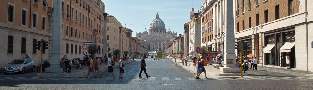
Rome
In contrast to New York’s fluctuating transportation volume, Rome’s transit frequencies remain remarkably flat throughout the day before slowing down to a steady near-standstill at night.
Boston
Boston boasts a diverse mix of transportation systems that includes buses, light rail, subways, trains and ferries. Geographically, the motion follows a clear hub and spokes pattern, with all lines converging at a single central point.
Mexico City
Unlike Boston’s hub and spokes layout, Mexico City’s transport flows are strikingly uniform across the city, carrying passengers back and forth and up and down with no obvious centre of activity.
San Francisco Bay
As a final treat, here is a view of the Bay Area, set to Claude Debussy’s Clair de Lune.
You can find examples for several other cities on Geary’s Vimeo page. And if you don’t find what you’re looking for there, why not try making a TransitFlow map yourself? You can find the code and instructions Github.
Follow Guardian Cities on Twitter and Facebook to join the discussion, and explore our archive here
